Personal site
Description
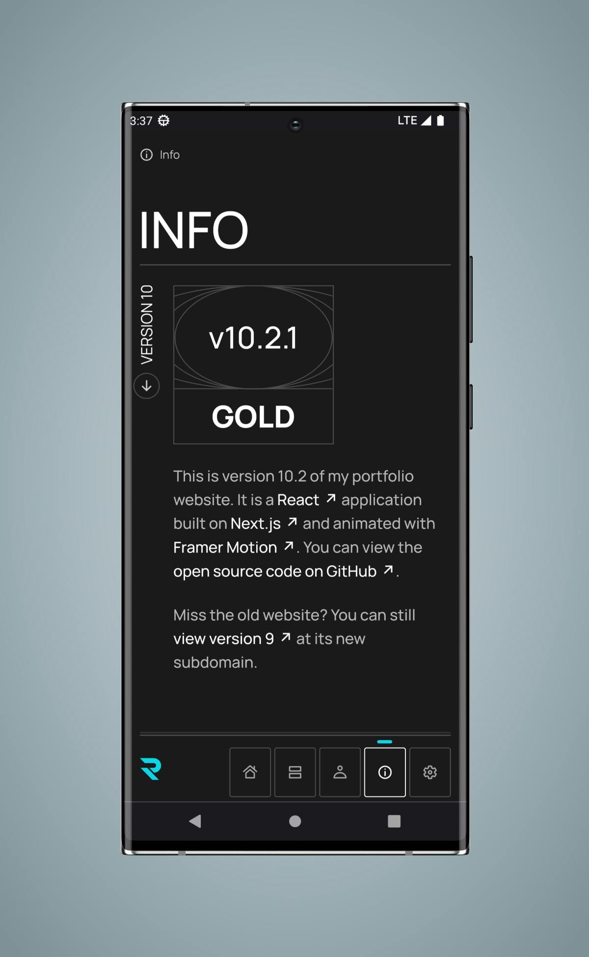
Two years after the release of richardfxr.com version 9, it was time for a complete redesign that focused on accessibility, animation, and maintainability while still paying homage to the old design.
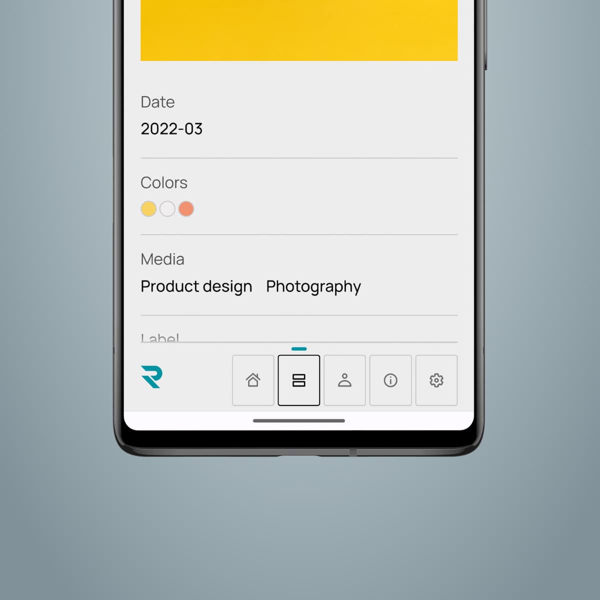
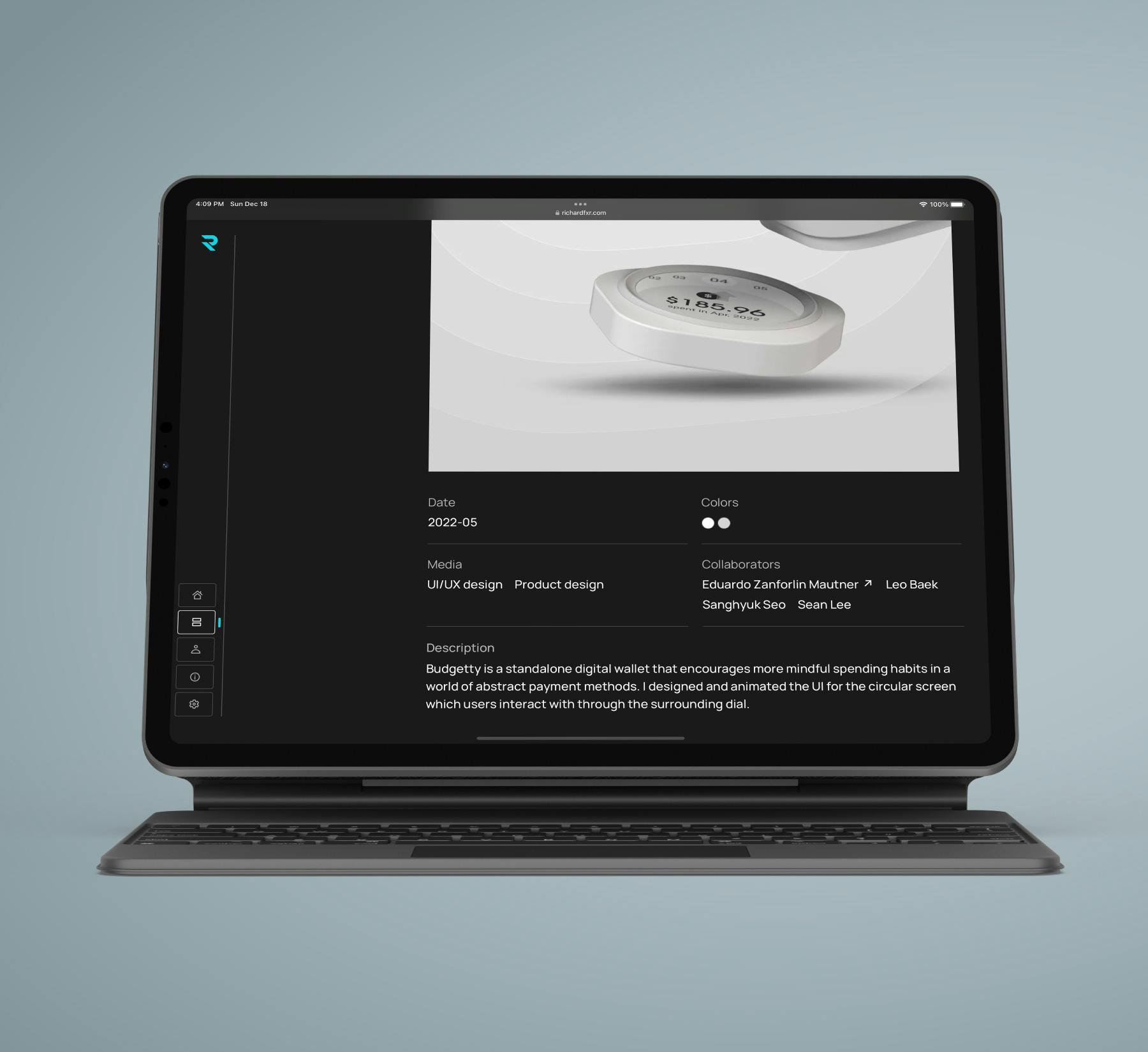
- Date
- 2022-08
- Colors
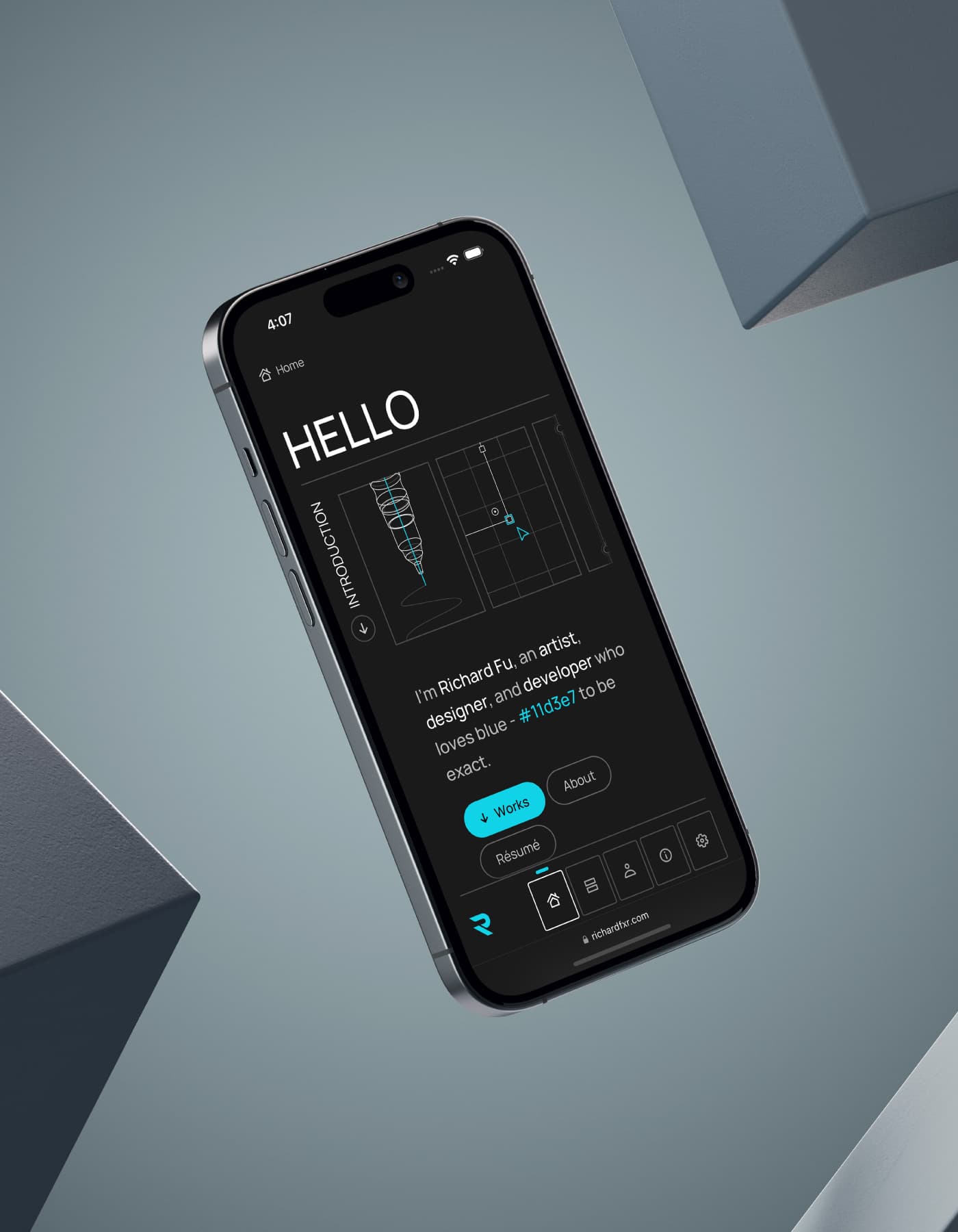
- Richard blue
- dark gray
- light gray
- Media
- UI/UX design
- development
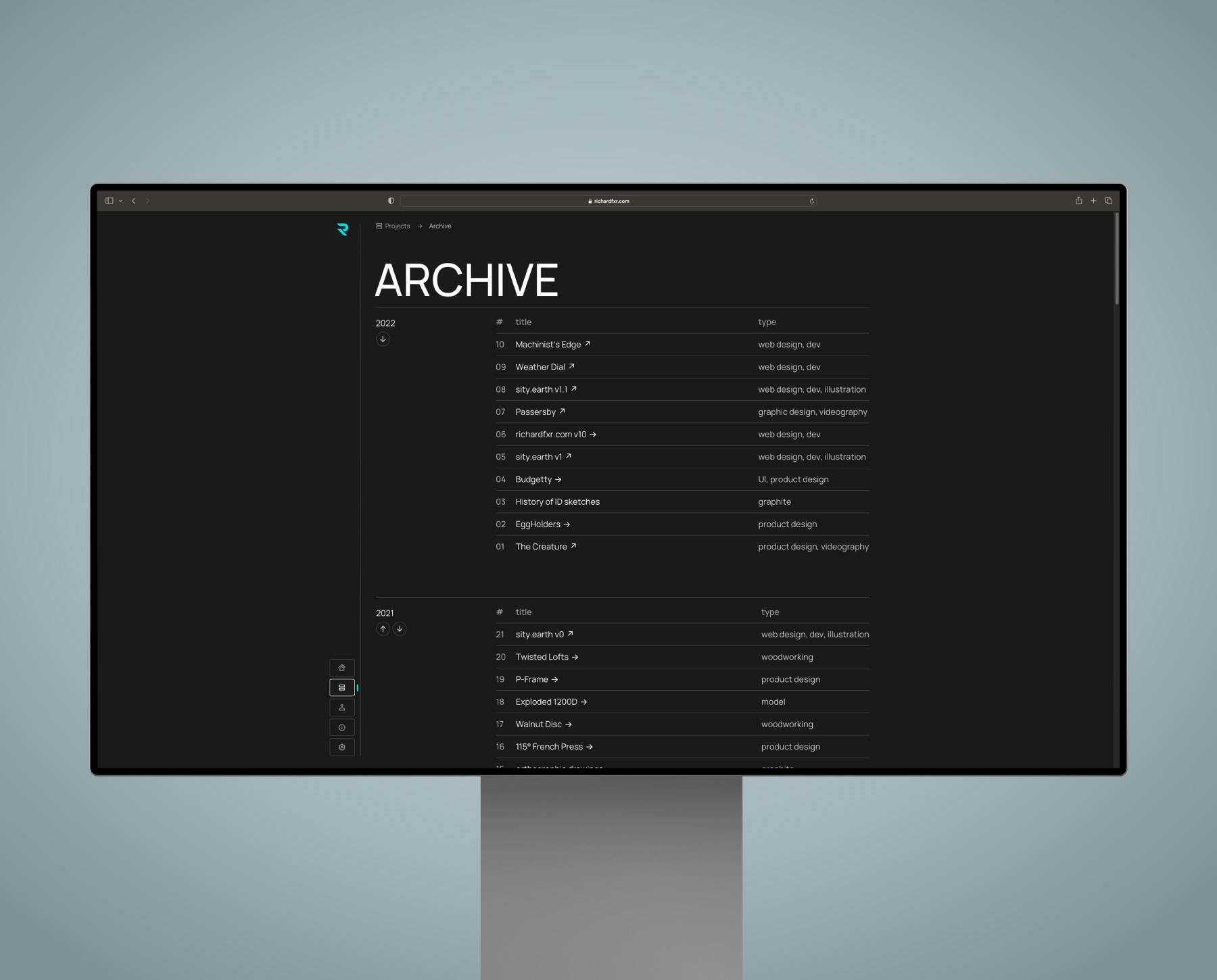
Evolution
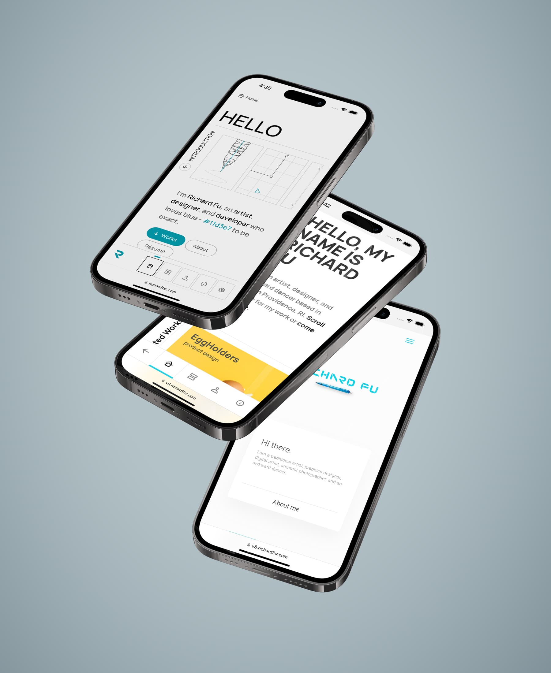
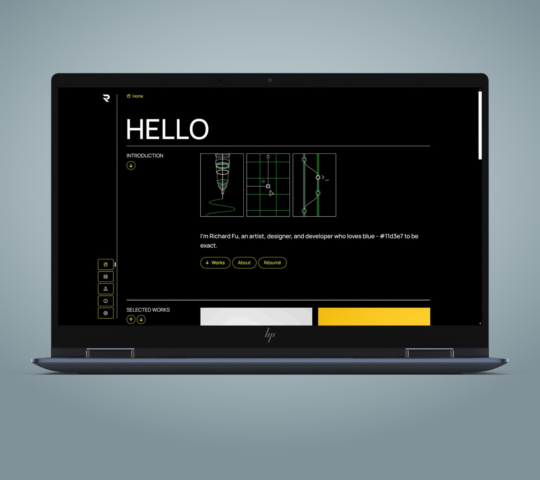
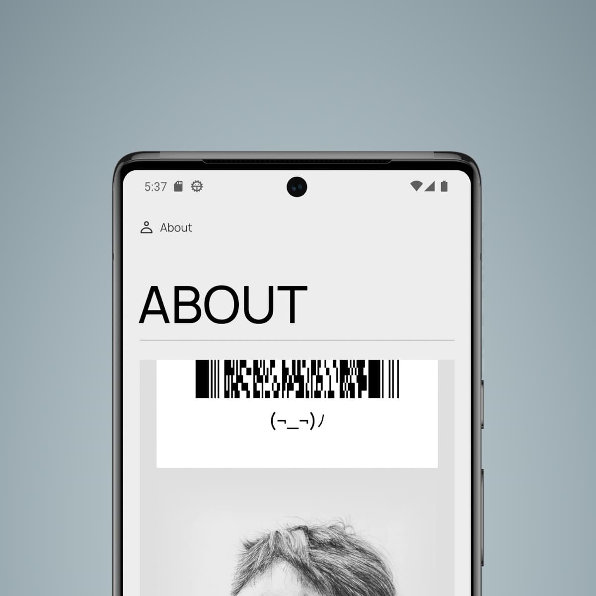
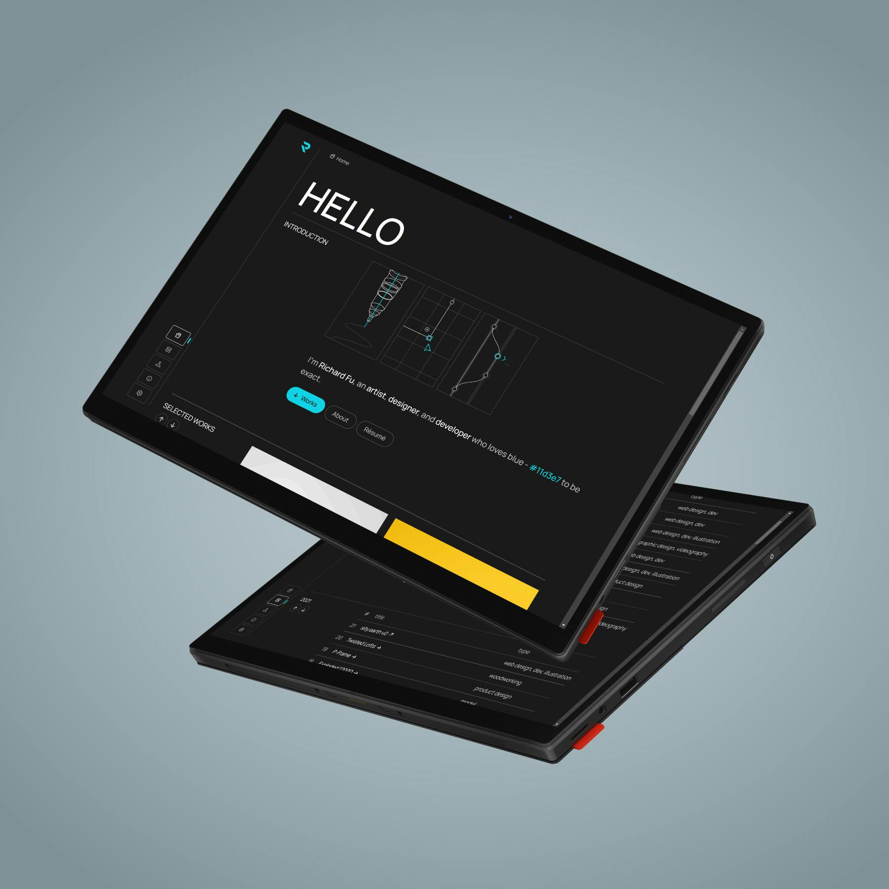
Familiar yet refined – that was the philosophy behind version 10's incremental redesign.
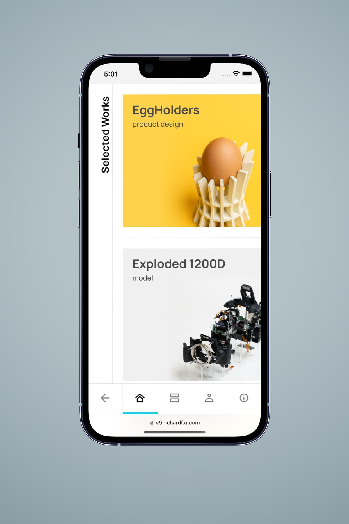
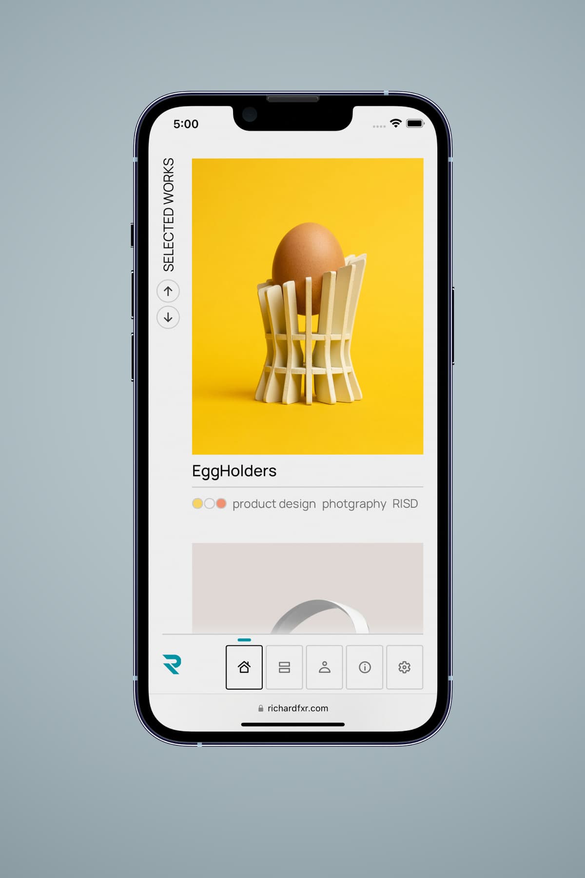
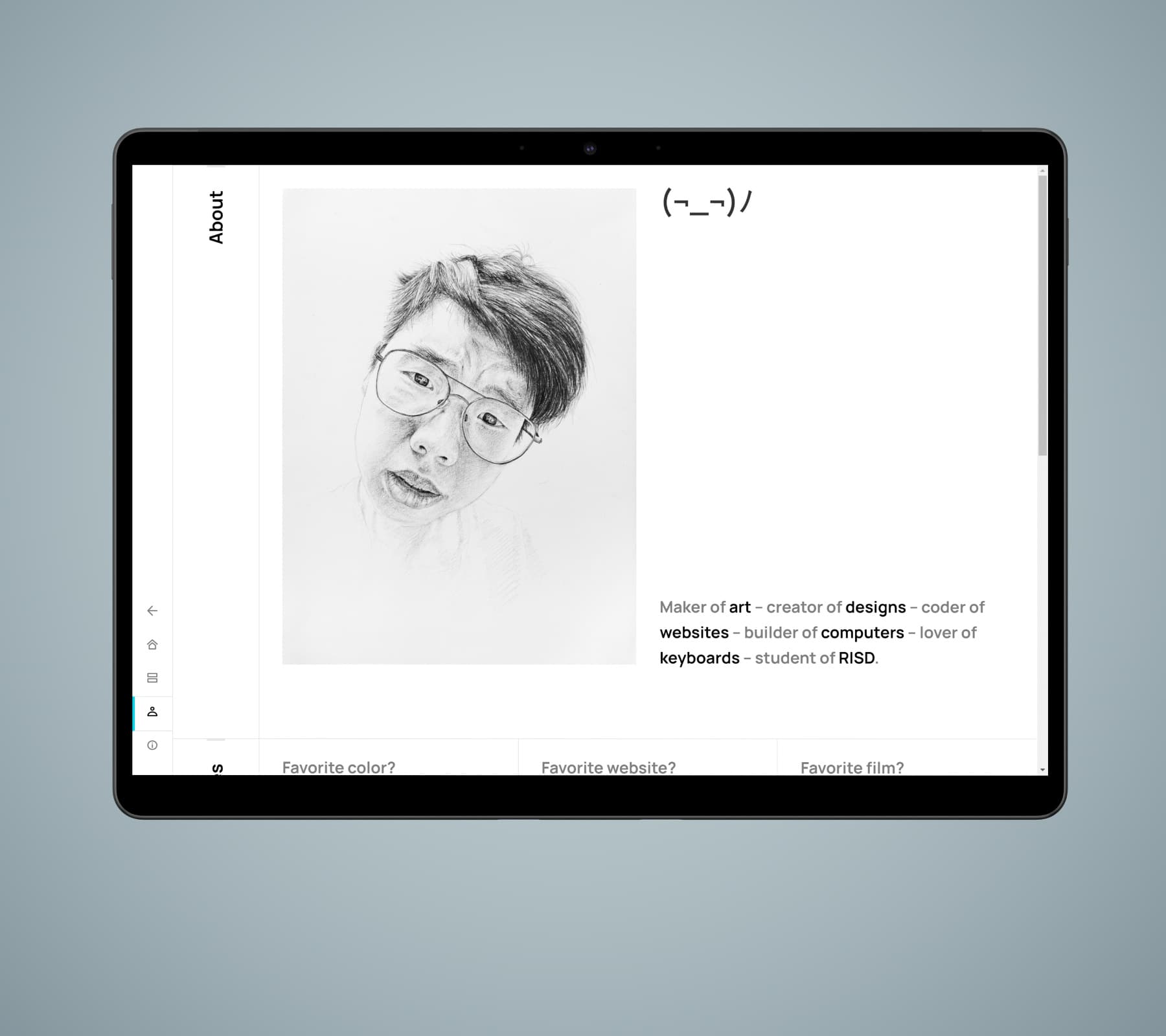
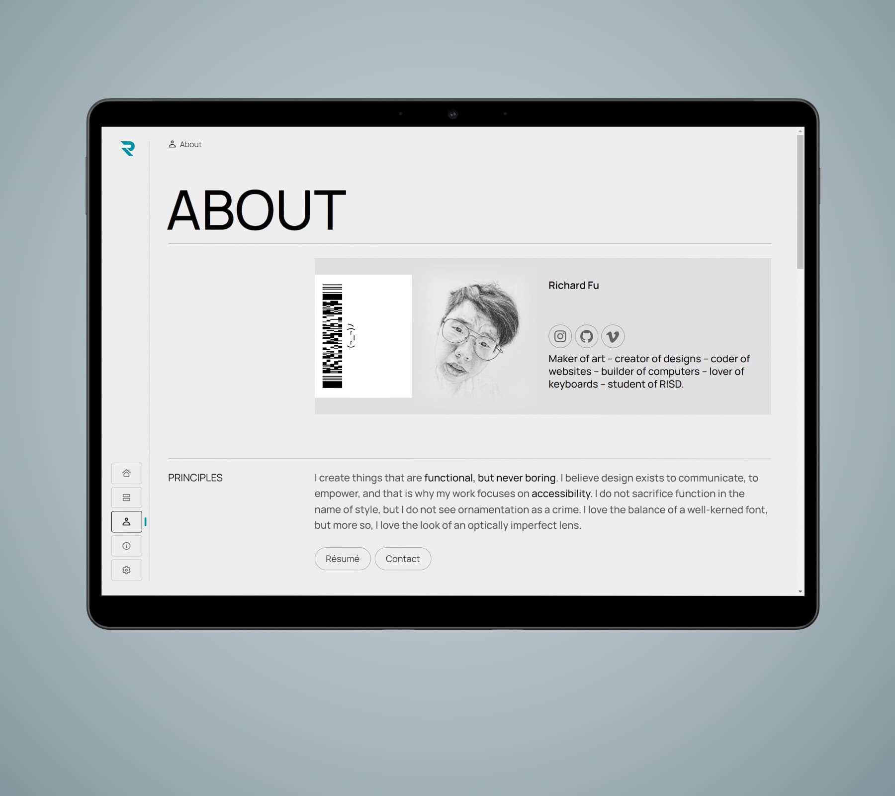
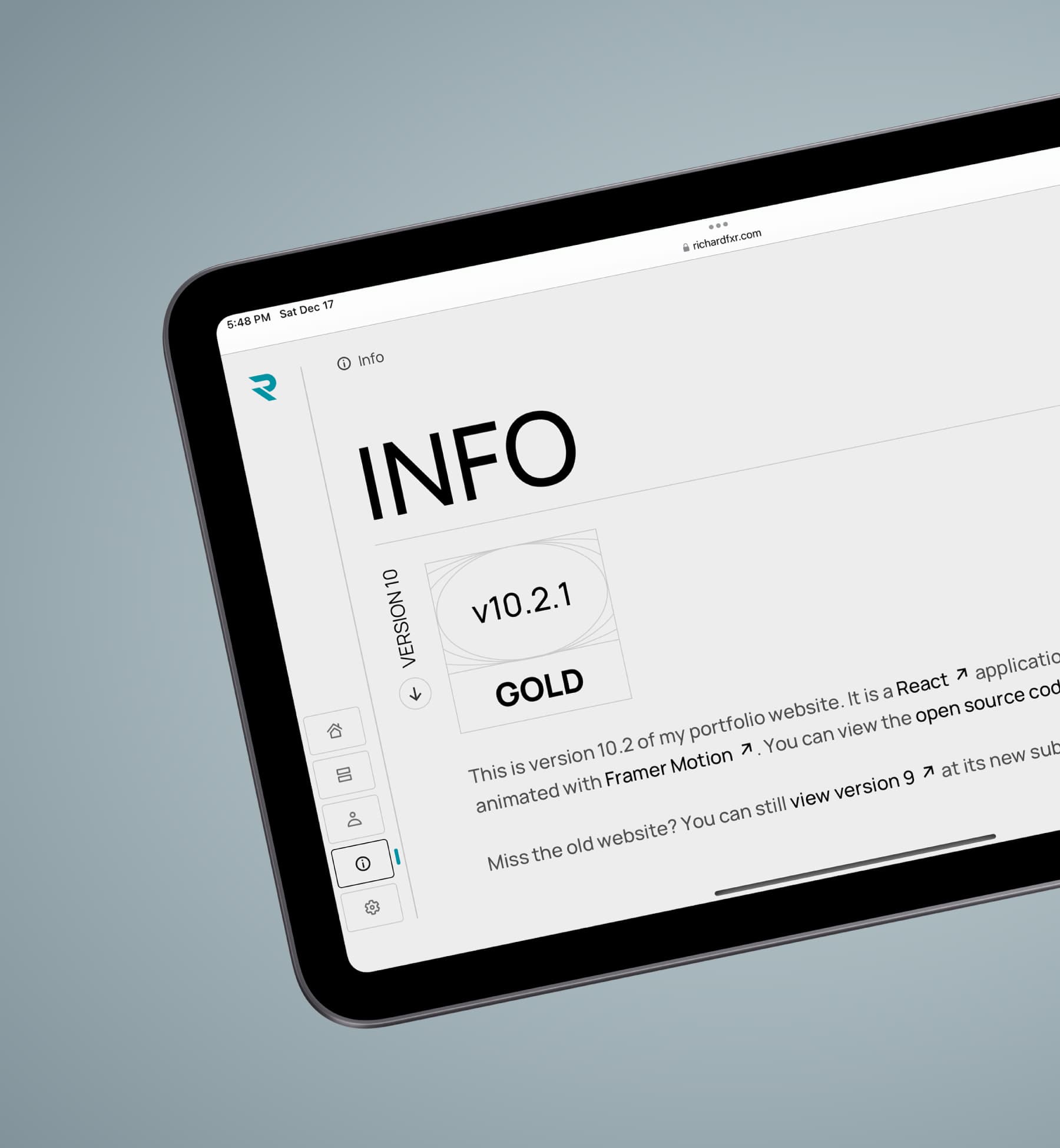
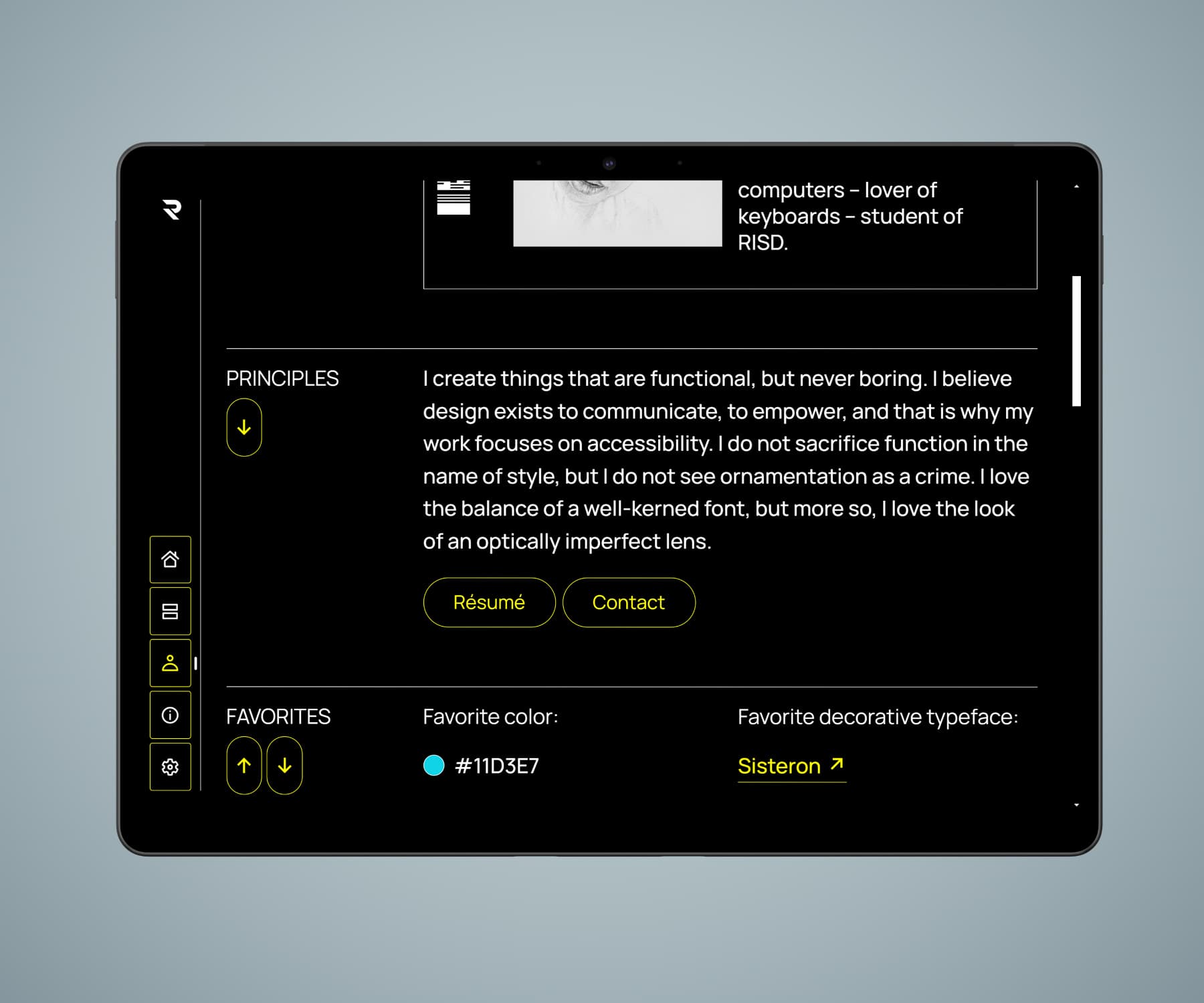
Version 10's design aims to be clean but decorated. The interface is clear, but not devoid of ornamentation.
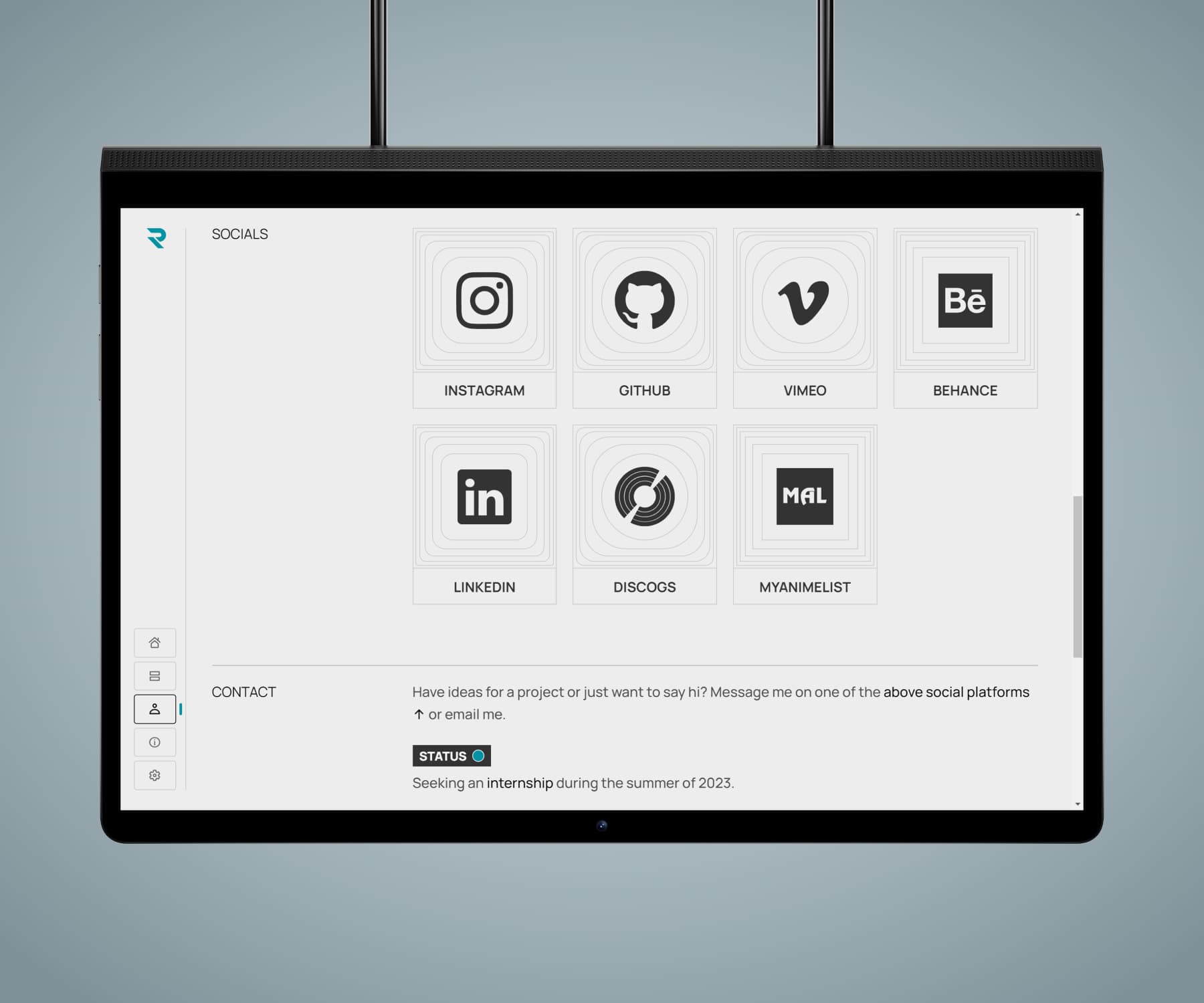
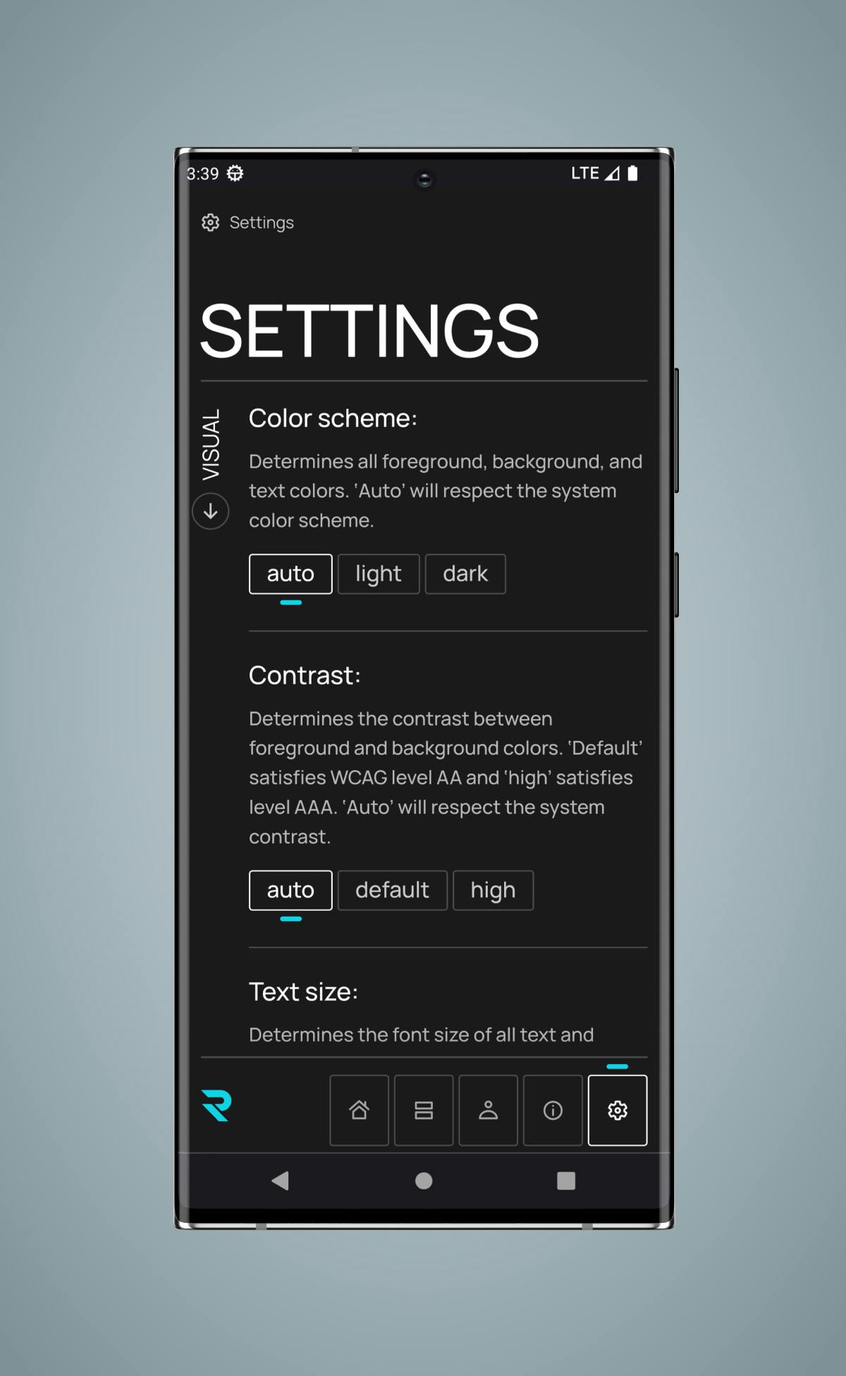
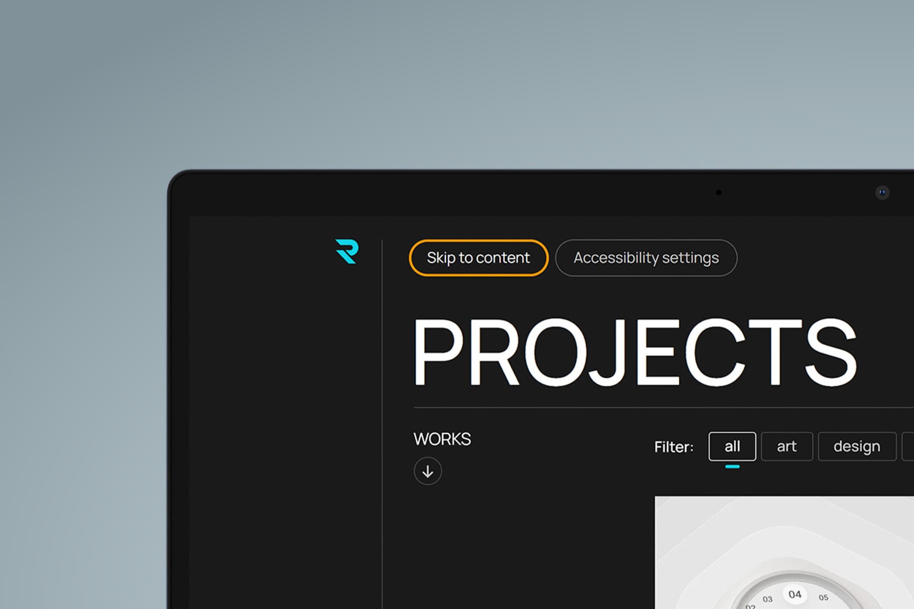
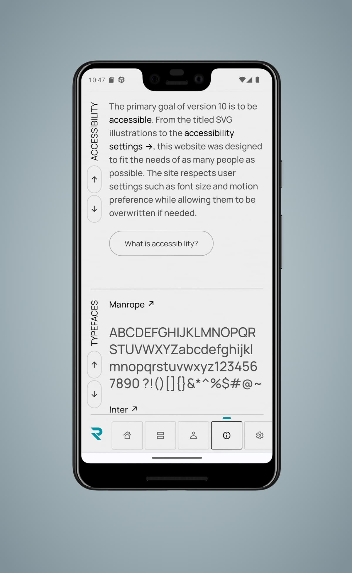
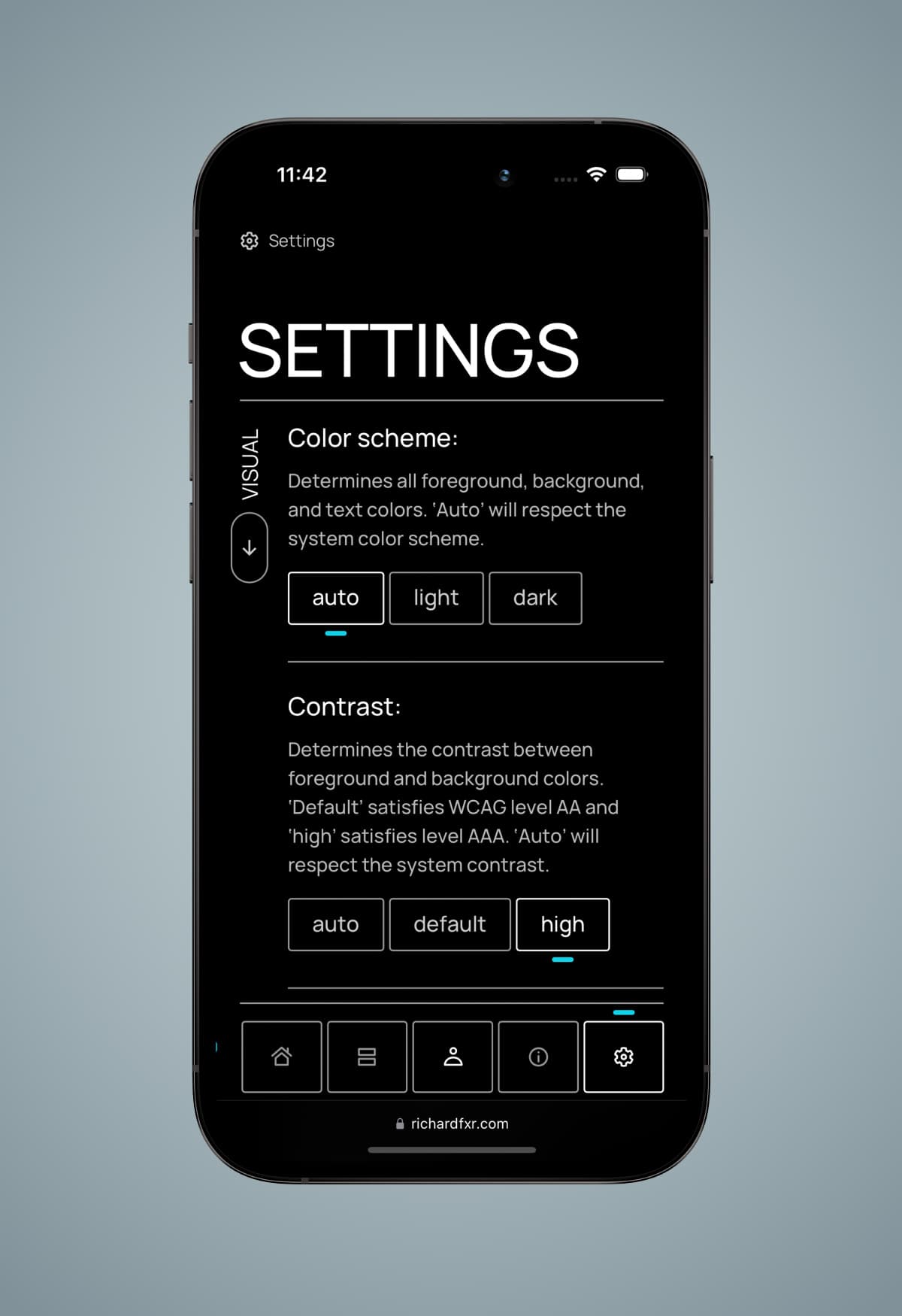
Version 10 is made more accessible through skip links, high contrast modes, size adjustments, low motion, and more.