Budgetty
Description
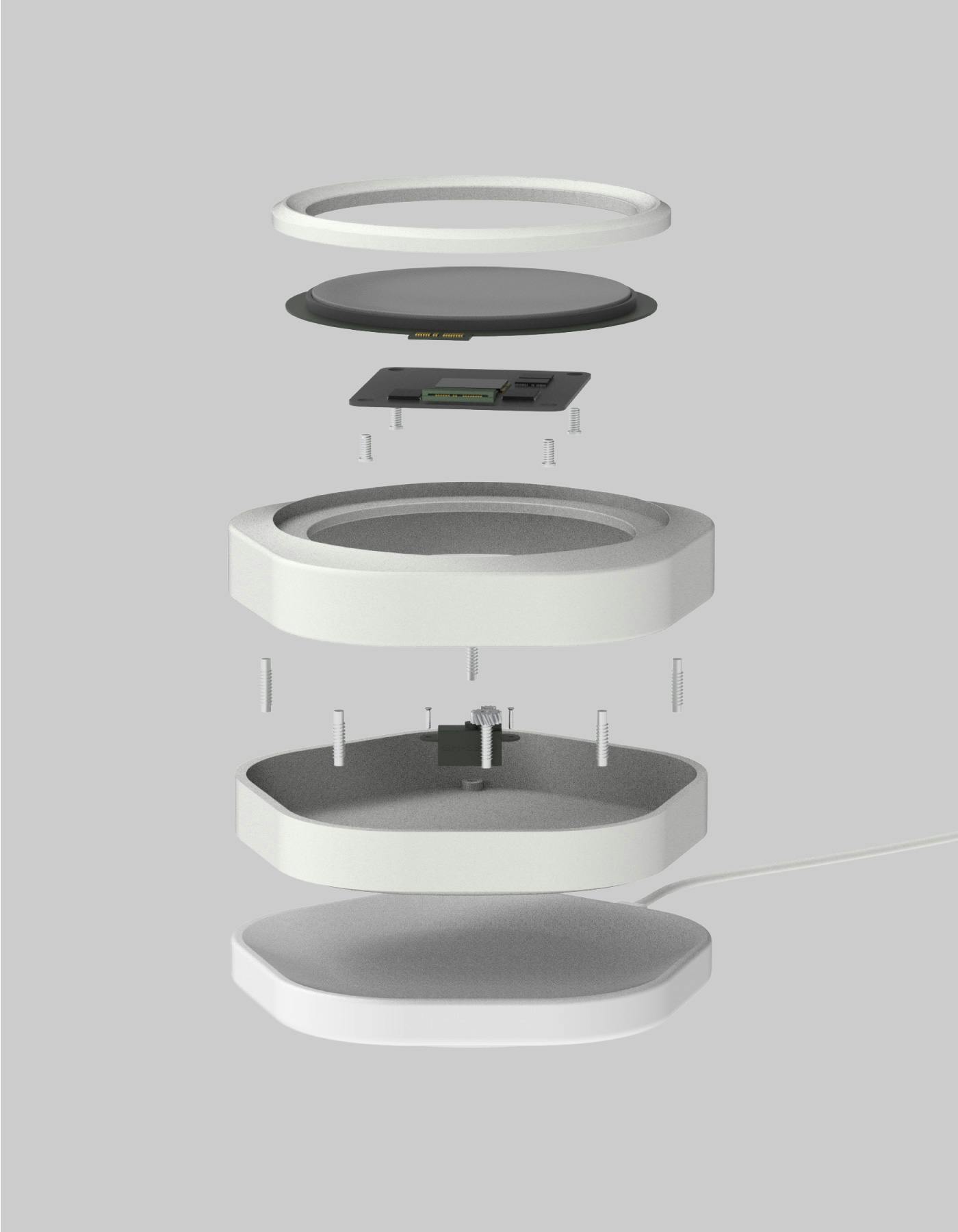
Budgetty is a standalone digital wallet that encourages more mindful spending habits in a world of abstract payment methods. I designed and animated the UI for the circular screen which users interact with through the surrounding dial.
- Date
- 2022-05
- Colors
- white
- light gray
- Media
- UI/UX design
- Product design
- Collaborators
- Eduardo Zanforlin Mautner
- Leo Baek
- Sanghyuk Seo
- Sean Lee
Video
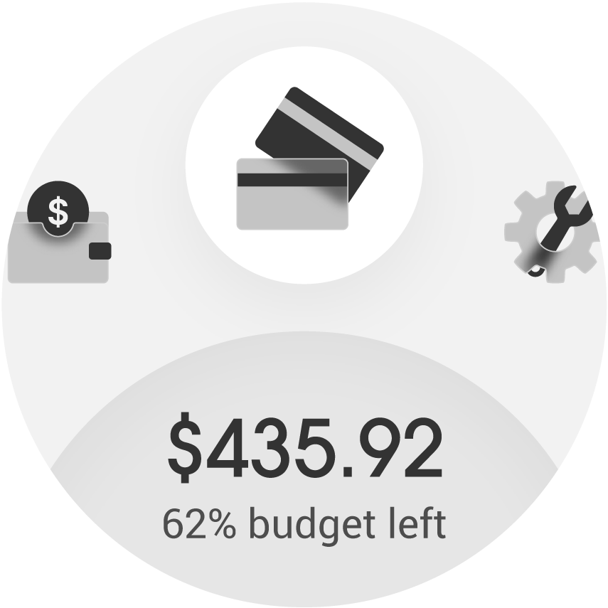
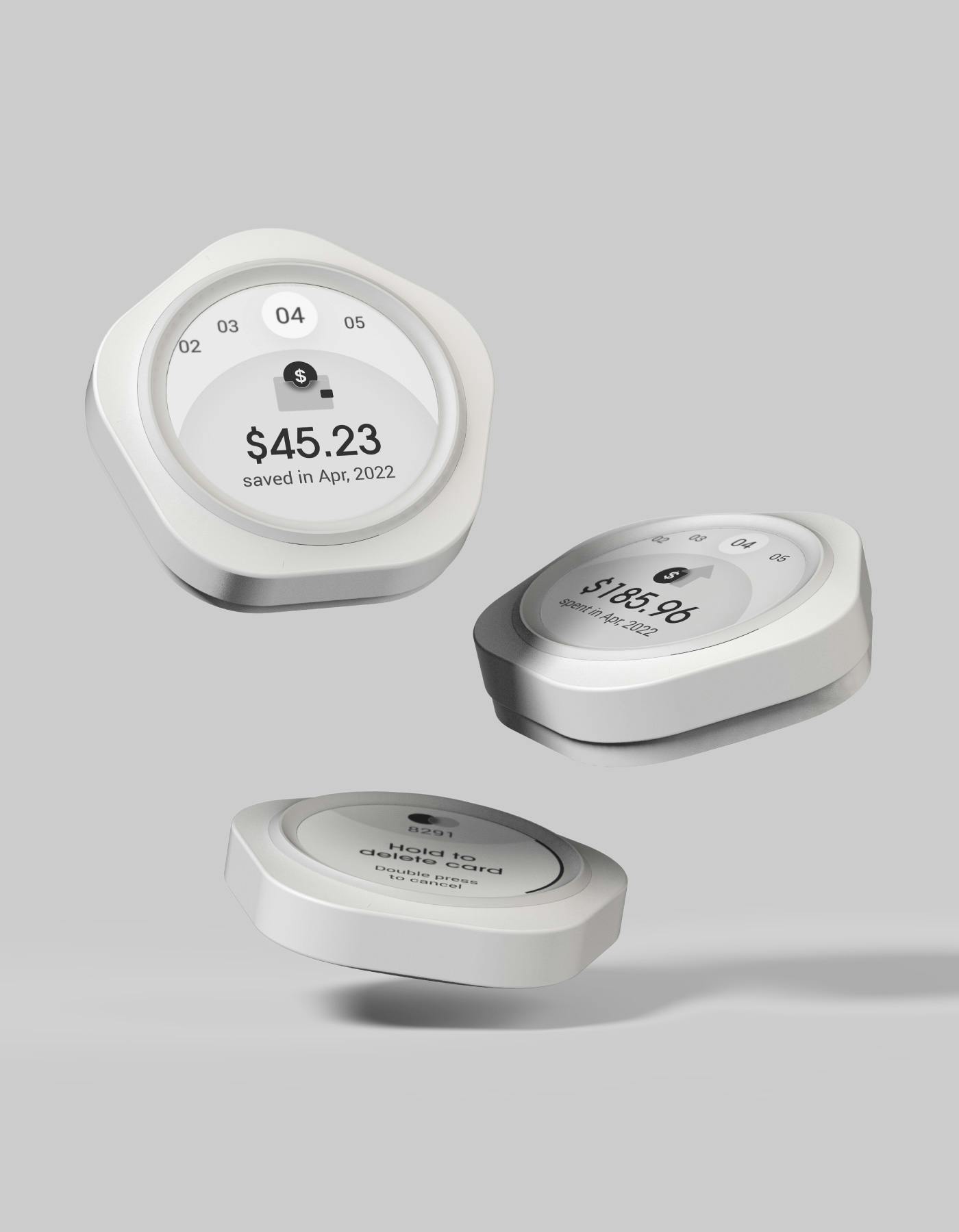
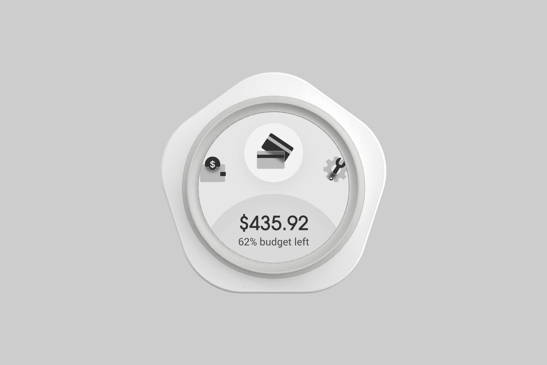
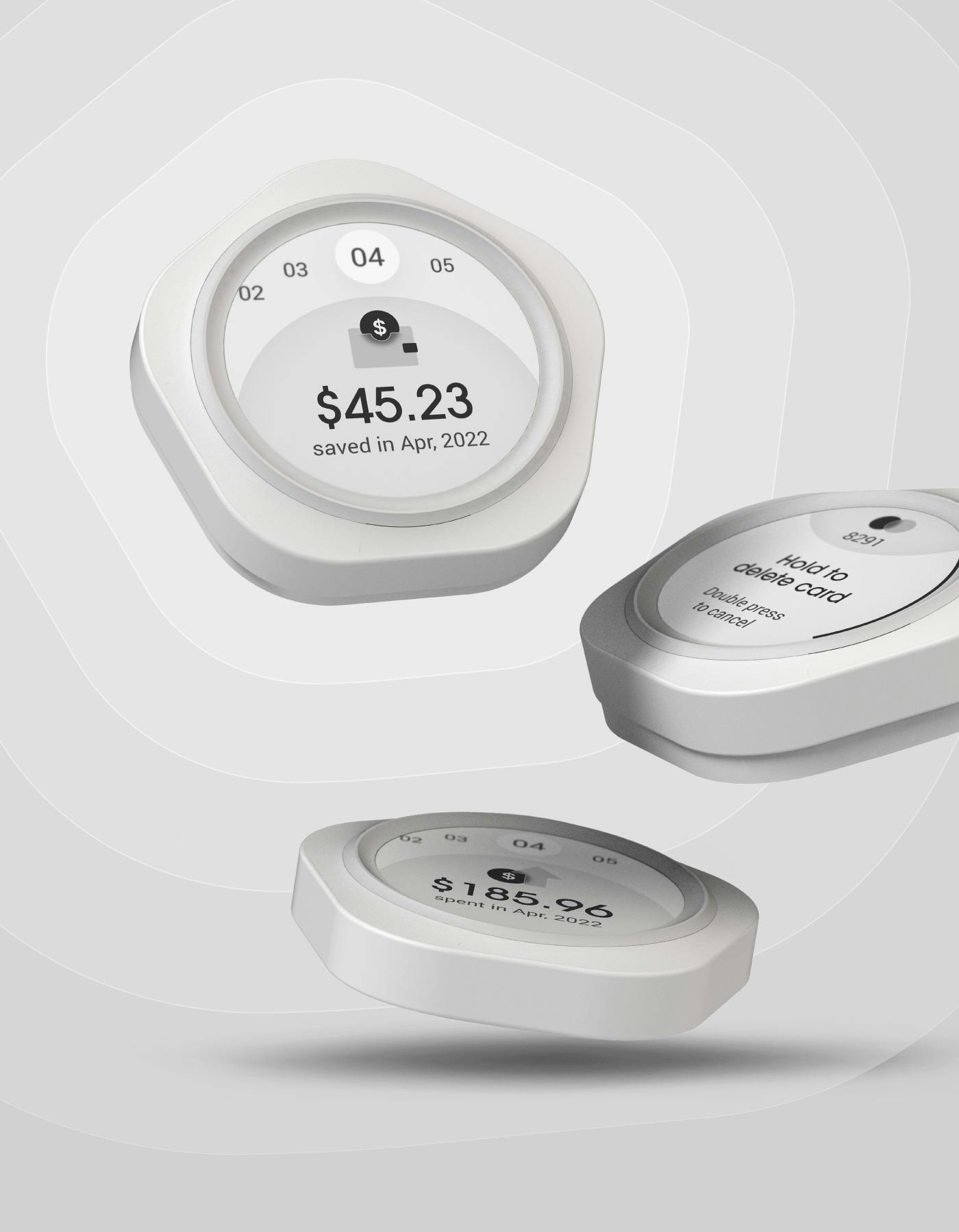
Home 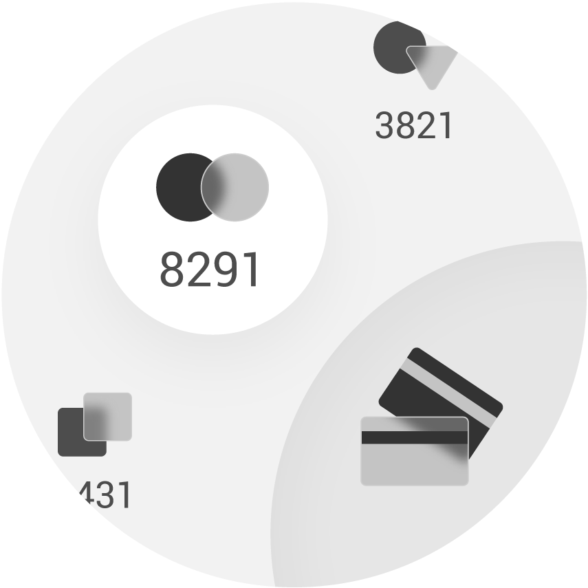
Card selection 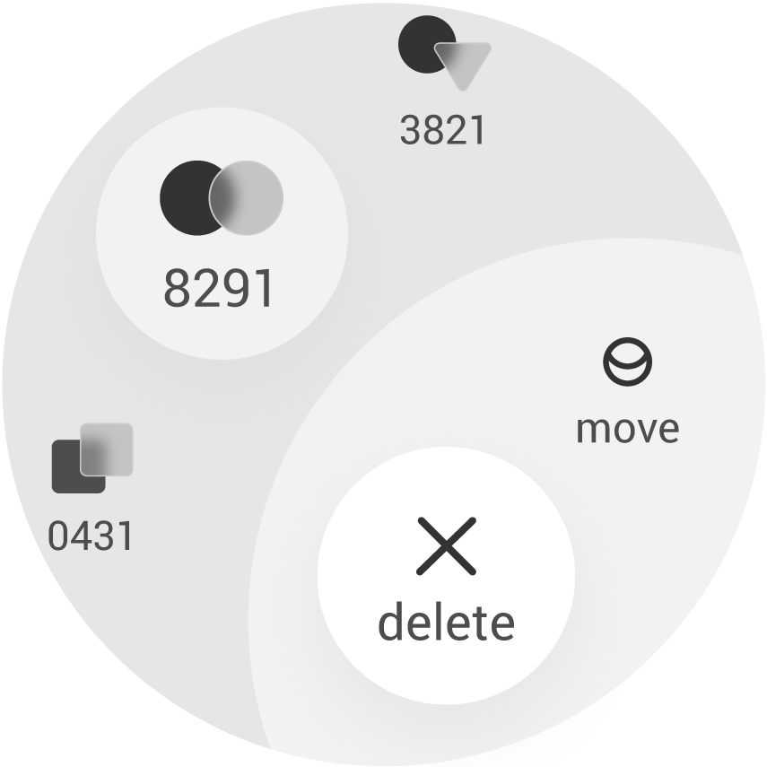
Card options 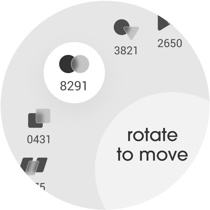
Reorder cards 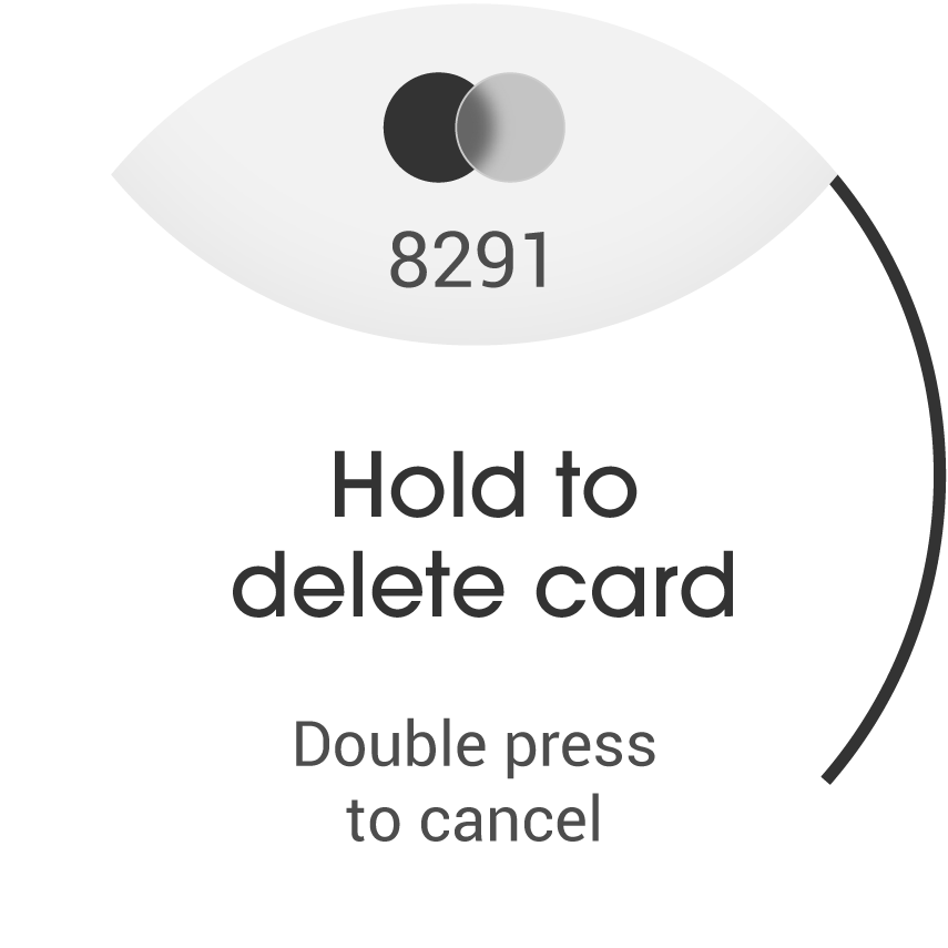
Delete card 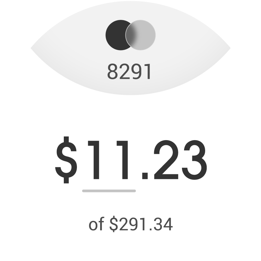
Payment input 
Payment confirmation 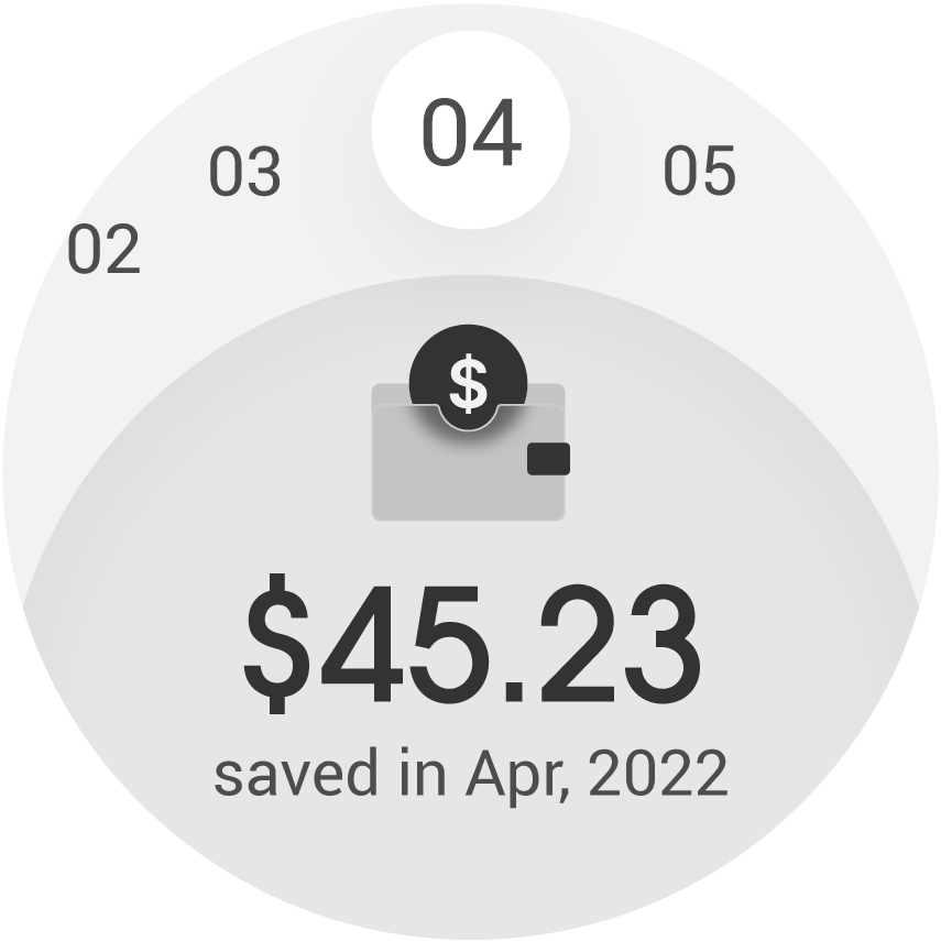
Monthly savings 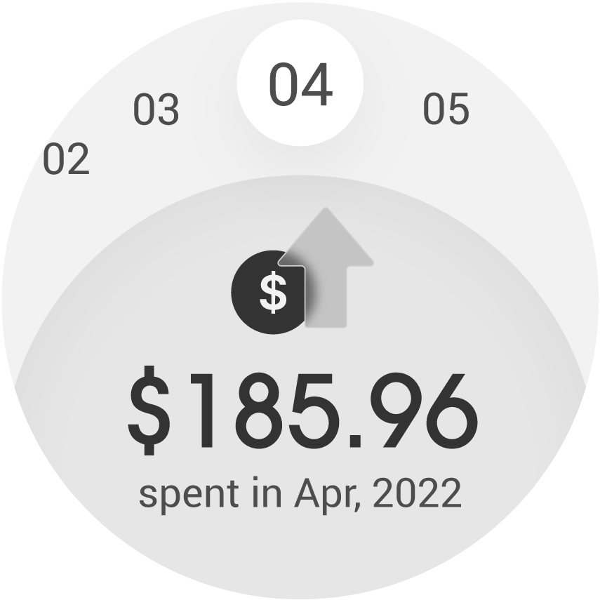
Monthly spendings 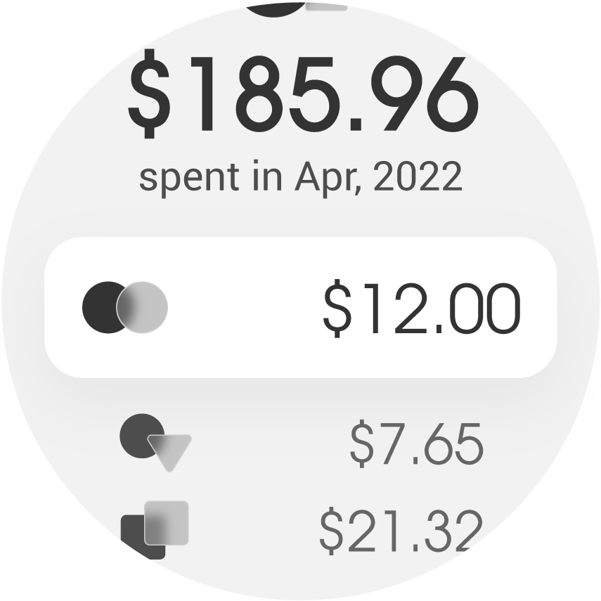
Spending history 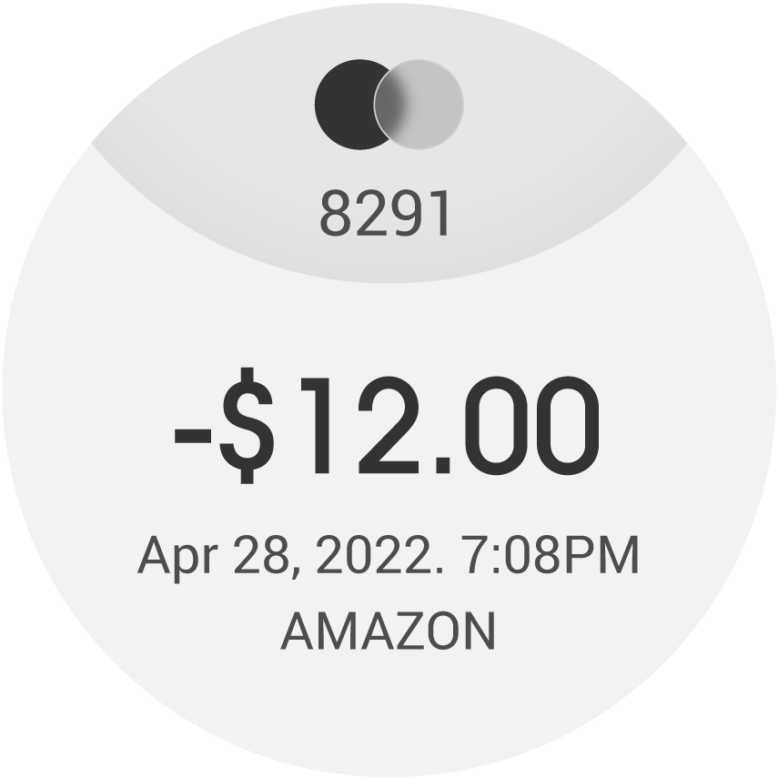
Spending detail